You’ve set up your website.
You’ve created calls to action.
You’ve incentivized customers to click forward.
Then, like a chef in the kitchen putting together multiple ingredients and expecting something spectacular to happen, you wait.
Then? Nothing happens.
What’s going on here?
When a potential customer doesn’t convert to a lead, there can be a wide variety of reasons.
After all, potential customers are people.
They may have things going on in their life.
They may have been turned off by some of your messaging.
They might like someone else’s brand.
But what’s most important here is that you understand why this is happening so you can avoid making the same mistakes in the future.
When it comes to converting potential customers into paying customers, sometimes, trial and error works best.
But we can still apply some tried-and-true methods to ensure that your customer sticks around. Here’s what you’ll need to know.
Step #1: Diagnose the Problem
If you were a doctor and your website were the patient, the first step is to diagnose what’s going wrong.
You can start doing that by poring through your analytics data. Here are some common causes of lack of conversions:
- Bounce rate. If you attract a high amount of potential customers to your site, but they only stick around for three seconds, then you have a clear issue: you have to get your bounce rate lower. You want customers to feel drawn in by interesting elements on your site. Look at your site from the perspective of a potential customer and ask yourself why they might bounce. You should also look at the individual pages on which your customers are most frequently bouncing.
- Load time. If you’re not used to evaluating a website’s success, then it might seem to you like “load time” is one of those technical statistics that doesn’t mean a lot to your customer conversion rate. But for the customer, it’s a very real phenomenon. Imagine it: you’re the potential customer and you’re browsing multiple websites, trying to find the answers you seek. Do you really want to wait on a website that takes twenty seconds to load, when there are others that will load in three seconds?
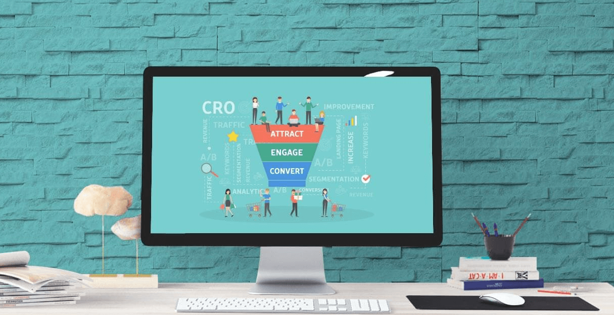
- Funnels. With your analytics, you can set up customer paths to help you gauge the potential customer’s journey into becoming a customer. This is not only great because it gives you a clear definition of what you want to happen on your site, but it will help you identify the stages at which you’re losing your customers most often. Your goal here? To discover those places where the customer doesn’t click forward. Compare the click-through-rates in each step (CTR) to see if there are any anomalies that need fixing.
- Customer feedback. This one often doesn’t have anything to do with analytics; instead, it’s about taking what your customers are saying for truth. It’s true that potential customers don’t always know the reason why they clicked away from a website, but if you gather enough customer feedback, you’ll be able to view your website’s issues in a broader sense, where the wisdom of the crowd starts to take shape.
There are, of course, more ways for your website to lose conversions than this.
But these are four great ways to identify some of the most common culprits and problem spots on your site.
Step #2: Remember Your Marketing Psychology
Sometimes, it’s not a technical issue that’s costing you potential customers. It’s a failure to invest in the psychology of the customer.
After all, your customers aren’t just stats on a sheet. They’re real people who need reasons to click forward and become paying customers.
That’s where marketing psychology comes in.
If you don’t have any of the following elements on your page, it may be that you’re not creating a compelling enough case for your potential customers to convert into paying ones.
Context
First off, your customers need context. Why are they at your site? Do you understand what their problems are? And how is what you do going to solve those problems?
For that reason, you’ll find that many astute Internet marketers are good at creating individualized landing pages for specific types of clients.
For example, let’s say that you wanted to target first-time homebuyers.
Would you talk about reverse mortgages to them?
Of course not! You wouldn’t expect these customers to stay on the page, let alone click forward and want to learn more.
You have to show your customers that you understand the context with which they approached you.
You’re the provider who has customers like them all the time. And because of that, you not only know what they’re going through, but you have exactly what they need to solve that problem.
For first-time homebuyers, for example, that might be some assurance and confidence that you can handle everything the right way.
It can also be a list of compelling reasons why they should buy a home.
Incentive
Why does a customer click forward?
At its most basic level, a customer clicks forward because something compels them to.
In this case, you need to create an incentive.
For some mortgage marketers, for example, an incentive for getting a potential customer to fill in their email address is to give them access to a tool—like a mortgage calculator—in exchange.
The “incentive” also works in your favor in terms of marketing psychology, because it hits on one of the touchstones in Robert Cialdini’s classic work on the matter: “Influence.” In that book, Cialdini talks about the law of reciprocity, in which people who would otherwise not go out of their way to be a customer sometimes do so when they feel they owe something back to the brand.
Not that you should get guilt working for you in this regard.
But if you’re asking your potential customers for something—like a click in the right direction—then it never hurts to incentivize that click.
Simplicity
Have you ever watched one of those restaurant review shows in which a professional chef enters a restaurant, and takes one look at the menu and knows something’s wrong?
It’s usually because the menu is too complex or elaborate.
After all, a large menu is usually a sign of a restaurant that’s trying to do lots of things well, but not any one thing with panache.
A book called “The Paradox of Choice” addressed this exact problem. Customers don’t know what to pick! The problem is that they end up not picking anything at all.
That’s why you’ll want to design a call to action that is simple, above the fold (i.e., customers don’t have to scroll down to find it), and clearly distinguished from the rest of your site’s content.
Sometimes, potential customers are simply not converting because they don’t know where to click.
But that doesn’t have to be you.
With the right principles applied—and an eye on our analytics—you can fix the issues that are causing your potential customers to not convert into leads.
Sign up for a free trial of leadPops to automatically incorporate these exact elements into your marketing efforts.


