If someone has visited your mortgage, real estate, or insurance website, then they have a decision to make. And it’s your job to help them make that decision.
Without any of the following five pages, however, they may never make the decision at all.
They may simply click “back” and return to the search engine or referring page from whence they came.
That’s right: any mortgage, real estate, or insurance website will want to have at least five essential pages that build your credibility, funnel the conversion, and ultimately help you make the sale.
But these aren’t merely pages you have to have on your page.
These are also pages you need to have optimized on your page.
What’s the difference?
Simple: if you have a landing page with no visible, compelling call-to-action, then it’s great that you have a landing page…but the fact that you have no call-to-action means the landing page is going to be essentially worthless.
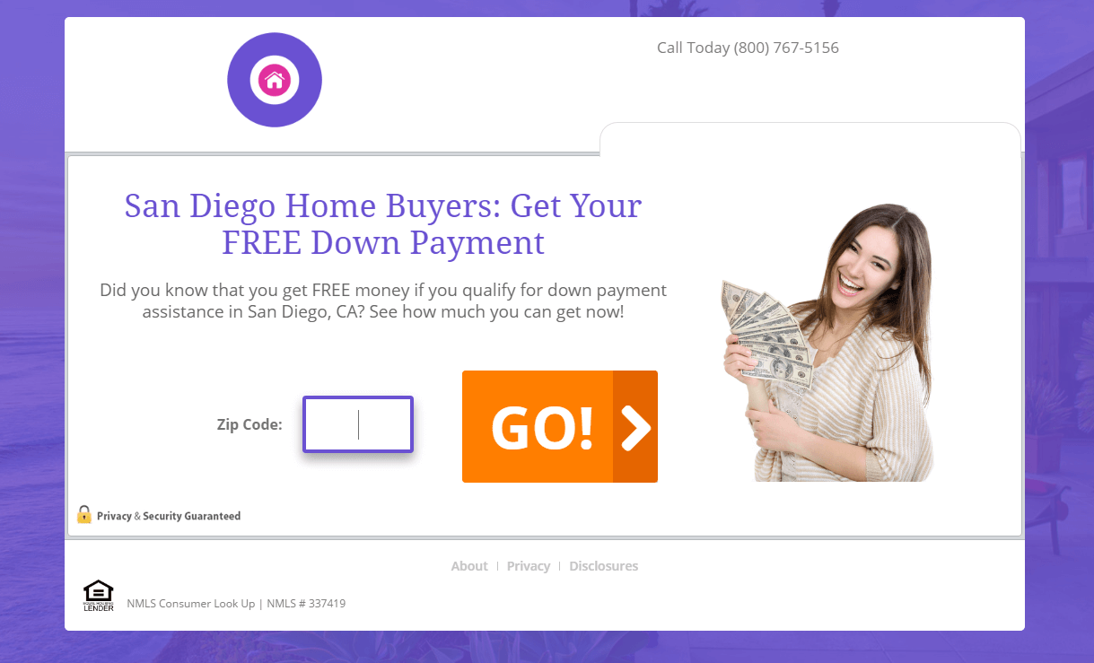
If, on the other hand, you have a properly optimized landing page that looks like this…

…then we’re getting somewhere.
Page #1: Your “About” Page
If you’re actively trying to make sales from your marketing efforts, you’re going to make an offer on your website at some point, even if it’s something as simple as requesting an email for a newsletter subscription or eBook to convert a visitor into a tangible lead.
It’s only natural for some visitors to grow curious about you and your operation at some point in the process.
That’s where the “About” page comes in.
But an “About Us” page isn’t there for a brief paragraph about you and your hobbies.
Think about it this way: your “About” page is an opportunity to separate yourself from all of the call centers and faceless companies they’ve seen before.
Sound vague? Let’s get specific with some ideas you can incorporate:
- Background: include education, experience, accomplishments, even examples of how you’ve helped clients in the past.
- Tell a story: You’ll want to include any relevant information about why you got into the business and what you’ve been able to do since then.
- Use a video: Introduce yourself in person with a video. It’s not necessary, but does offer a nice “touch” that helps people to feel like they know you. Keep it short and sweet: about 60-90 seconds.
Incorporate each of these elements on your “About” page and you’ll do far more to convince your visitors that you’re trustworthy than an ordinary page with one or two canned paragraphs on it.
Page #2: Your Customer Reviews Page
There might be no more important factor in determining how people make decisions online than the social factor.
According to some statistics, as much as 88% of people trust online reviews they read.
It’s just human nature: when we hear something positive directly from the source, we’re inclined to be skeptical. But when we heard it from a third party, the credibility goes up by a lot.
That’s why mortgage, real estate, and insurance websites (and any website for that matter) should always include a customer reviews page.
The more you can do to boost the credibility of this page, the better. For example, include pictures of customers (with their permission) whenever possible.
Ask for as many quotes as possible.
Keep stacking those customer reviews so that people don’t only see that one or two customers enjoy your work—but that you have a habit of making clients happy.
Again, you can use video testimonials to boost this power even more. When you see someone volunteering their own opinion on video, it has a powerful effect—it boosts your credibility and shows that your previous clients were real people who received real benefits from working with you.
The same effect can take place when you build a Trusted Partners section.
By building referral-based relationships with trusted partners—many of whom your potential clients may have worked with before—you established your own credibility in the same way.
It’s up to you to make sure potential clients can see this information.
Make sure that any “Customer Reviews” and “Trusted Partners” sections are easy to access, easy to see, and look just as credible as the rest of your site.
Page #3: Your Landing Page
There’s nothing more important to optimize than your landing page.
Think of it as the “front door” to your website.
Even more than your main page, the landing page will generally determine the conversion rate of your online marketing efforts. That’s why it’s worth taking the time to optimize the following elements:
- Call-to-action: Your call-to-action button shouldn’t only be big and bold, but should include something compelling when it comes to the language.
- Design: Is it obvious where the call-to-action is? Is it obvious what your offer is? Is the page simple? Does the form engage people, or scare them off?
- Trust: Does your landing page include some sort of element that communicates your security or trust to the visitor?
These visual elements may seem like small tweaks, but they can each have a dramatic impact on how many visitors convert into legitimate customers.
Page #4: Your Mobile Version
This one is invisible.
Unless you’re on a smart phone.
With more and more Internet users around the world turning to mobile surfing for their Internet needs—even when it comes to mortgage, real estate, and insurance—you’re going to have to accommodate.
In 2017, your website needs to be mobile responsive—meaning it looks great and conforms to any size mobile device. Without a mobile-optimized website, you’re missing out on 40-60%+ of the potential clients that find you online.
And don’t forget to test out the mobile version of your website yourself. You’d be amazed at what you can discover by simply viewing it on your mobile device(s).
The point is simple: some people won’t view your website with anything but a smart phone. You don’t want to lose out on potential clients because your site is difficult to use on a smartphone or tablet.
Especially when it’s such an easy problem to fix.
Page #5: Your Homepage
Last but not least, let’s think about your homepage for a second:
- Is it easy to navigate? For example, can someone find all of the above pages easily? Do you include the most important links and calls-to-action “above the fold” so no one has to scroll down to find them?
- Do you include contact information? This helps you build a sense of trust and legitimacy with your target audience.
- Do you include a compelling introduction? A video can be great, or even a basic message with a clear call-to-action headline can make a world of difference in terms of converting your visitors into leads.Conversely, having a giant rotating photo slideshow with various animated messages and no clear call-to-action, along with a barrage of text and navigation links on your homepage?
That will confuse visitors and end up driving them away without a conversion taking place, which is money out the window and a costly mistake that you can easily fix.
Many people end up your homepage, regardless of how they entered your website—they have a habit of doing so online and want to search around your website before they make a buying decision.
Visitors may want to look around before giving out their email for your newsletter, or filling out the form on one of your landing pages.
Optimize these five essential pages and you’ll be on your way to boosting your conversions and attracting even more people to your mortgage, real estate, or insurance business.
Of course, all of this optimization will be a lot easier if you try out leadPops for marketing optimization and lead generation yourself!


